Web design, iconography, and illustration for Facebook's global cryptocurrency initiative — designed and shipped at BUCK Design over three months in 2019.
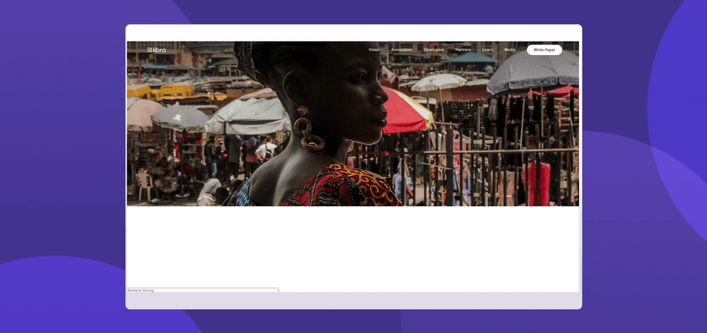
In 2019, Facebook announced Libra — a global cryptocurrency backed by a reserve of assets, designed to enable simple, low-cost financial transactions for anyone with a smartphone. The scale of the ambition demanded a visual identity to match: a website, a comprehensive icon system, and a set of editorial illustrations explaining the technology to a global audience.
Working at BUCK Design as UI/UX Designer, I contributed across the full visual scope of the project — from the motion-forward homepage experience to the icon library and supporting illustrations used across libra.org. The project was later rebranded as Diem in 2020, for which I also produced motion and visual assets.
The Libra icon set was built to communicate complex financial and technical concepts clearly and accessibly. Each icon was designed on a consistent grid with careful attention to weight, optical balance, and legibility at small sizes — supporting both the website and any downstream product surfaces.
The libra.org homepage and white papers section were designed to make dense technical content feel approachable. Animated transitions, scroll-triggered reveals, and a clean typographic system gave the site a modern, trustworthy feel appropriate for a global financial product.
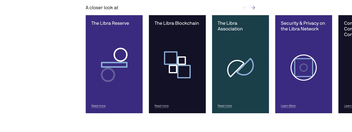
Four hero illustrations were created to explain the core pillars of the Libra ecosystem — vision, blockchain infrastructure, reserve backing, and the role of the Libra Association. Each one needed to be technically accurate, globally legible, and visually consistent with the broader Libra brand.

Vision — Libra's mission to provide financial access to everyone.

Blockchain — the distributed ledger technology underlying Libra.

Reserve — the asset-backed reserve model that stabilizes Libra's value.

Role — the governance structure of the Libra Association.
In December 2020, the Libra Association rebranded as the Diem Association, with an updated visual identity and renewed focus. I produced visual assets and motion graphics for the rebrand rollout — including this statistics explainer video, where I generated the majority of the visual elements.
Work completed at BUCK Design, Oct 2018 – Feb 2019, with additional Diem rebrand motion work in Dec 2020. Originally at libra.org, later rebranded as the Diem Association.