← All work
Visual Systems · Payments · Amazon Business · 2023

Amazon Business
Pay Studio

An atomic design system for payment methods, and the first library of its kind in Amazon Business Payments.

Role
Visual Systems Designer
Team
Amazon Business
Scope
Wireframes, prototype, production
Deliverables
Component, template & use case libraries
Components
Forty-seven parts, and the anatomy they share
Read→
Templates
One base sheet, specialized into task interfaces
Read→
Structure
Three layers, component to complete journey
Read→
Overview

A payment design system built for speed

Amazon Business doesn't have one payment flow, it has dozens: cards, bank accounts, wallets, buy-now-pay-later, benefits cards and local schemes, across markets and account types. Before Pay Studio, each one was designed from scratch, so the same sheet got redrawn a little differently every time.

Pay Studio turned that into an atomic system. Components build templates, templates build use cases, and designers assemble a new flow instead of starting from a blank frame.

I built it in 2023, when shared component libraries were still new at Amazon. It was one of the first of its kind at the company and the first in Amazon Business Payments.

80%
Adoption within the first eight months
1st
Library of its kind in Amazon Business Payments
Global
Used by Amazon Business designers worldwide
47
Named components, each specified for mobile and desktop

Explore the full system in Figma →


The model

Three layers, component to journey

Each layer is built from the one below. Components are the parts, templates are complete task screens, and use cases wire templates into a journey a customer finishes.
1 / 3
Layer one

Components

The parts a payment screen is made of, like Primary payment method, Input card and Sticky footer. Each one owns its states, so templates never have to.

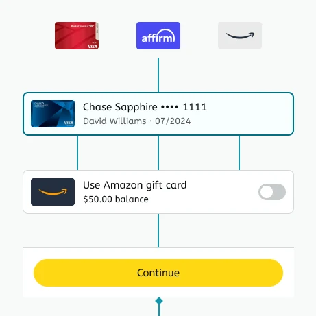
The Primary payment method component in the Pay Studio Figma file, wired to its card logos, the gift card row and the Continue footerFrom the Figma file
Layer two

Templates

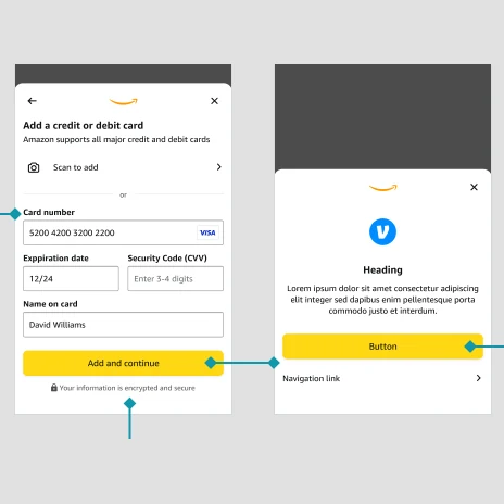
Complete screens for one task: pick a method, add a card, verify a number. All built on one base sheet, so they stay consistent on their own.

Two Pay Studio templates in the Figma file, Add a credit or debit card and a base sheet, linked by prototype connectorsFrom the Figma file
Layer three

Use cases

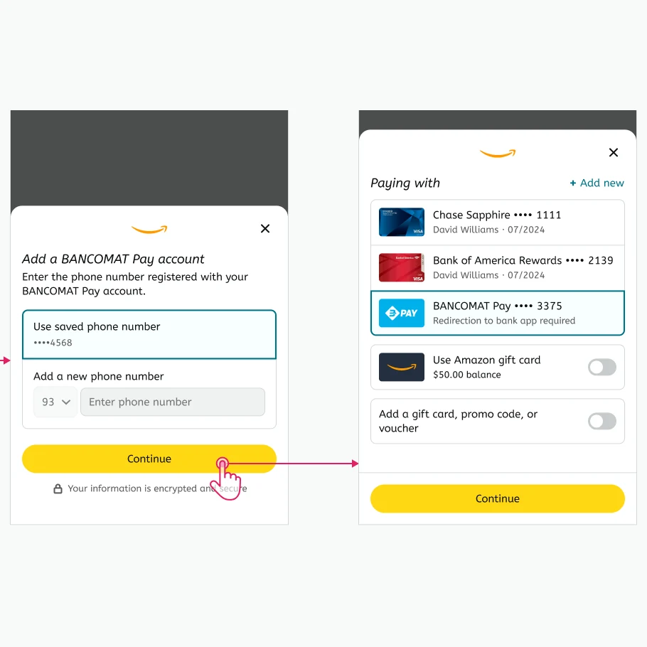
Templates wired into a journey. This is where the product decisions live, which screens and in what order. Nothing new gets drawn here.

The last two steps of the BANCOMAT Pay use case: register a phone number, then back to the wallet with BANCOMAT Pay selectedFrom the Figma file

Layer one

Forty-seven components

The library holds 47 components, Accordion to Toast, each specced for mobile and desktop. The payment ones share an anatomy. Here's Primary payment method, the row every wallet is built from.

Chase Sapphire •••• 1111
David Williams·07/2024
Use rewards points ($25.00)
2,500 points available
  1. 1Asset slot. Filled by Art, so every method takes the same footprint.
  2. 2Primary label. Method name and masked number.
  3. 3Secondary label. Cardholder and expiry, or why it's ineligible.
  4. 4Feature slot. Takes any Feature component.
  5. 5Trailing control. A Switch here. The row picks the control, not the template.
  6. 6Selection state. One treatment for every method type.
Rebuilt in code from the library spec. The switch works.

The feature slot is the clever part. Rewards, installments, an expired card or a currency change all drop into the same slot, so a new payment feature is a new component, not a new wallet. Try one:
Chase Sapphire •••• 1111
David Williams·07/2024
Use rewards points ($25.00)
2,500 points available
Feature reward balance. Points as payment. Switch it on and an amount field opens.
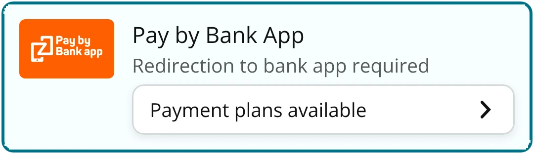
Pay by Bank App method, selected, with a Payment plans available button
Feature financing. An entry point into payment plans.
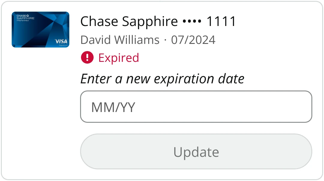
Chase Sapphire card marked Expired, with a new expiration date field and an Update button
Feature expiration. Flags an expired card and takes a new date inline.
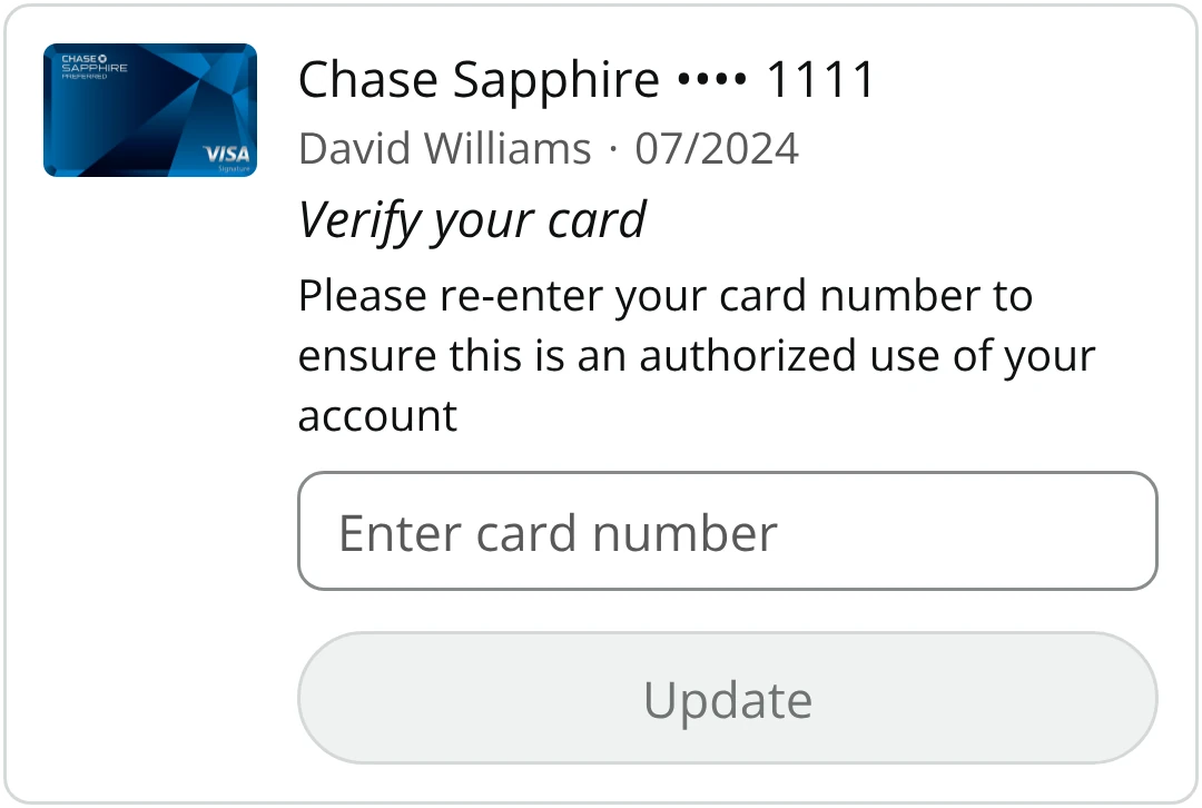
Chase Sapphire card with a Verify your card prompt, a card number field and an Update button
Feature card verify. Re-confirms the card number, right in the row.
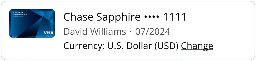
Chase Sapphire card with Currency: U.S. Dollar (USD) and a Change link
Feature currency. Shows the charge currency. Change opens a sheet on mobile, a modal on desktop.
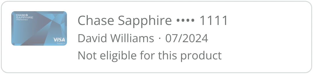
Chase Sapphire card, dimmed, marked Not eligible for this product
Feature detail. One line of status, here marking a card ineligible.
Chase Sapphire card with no feature, basic state
Empty slot. Nothing in the slot, so the row collapses to its basic form.

A few more from the library:

1 / 8
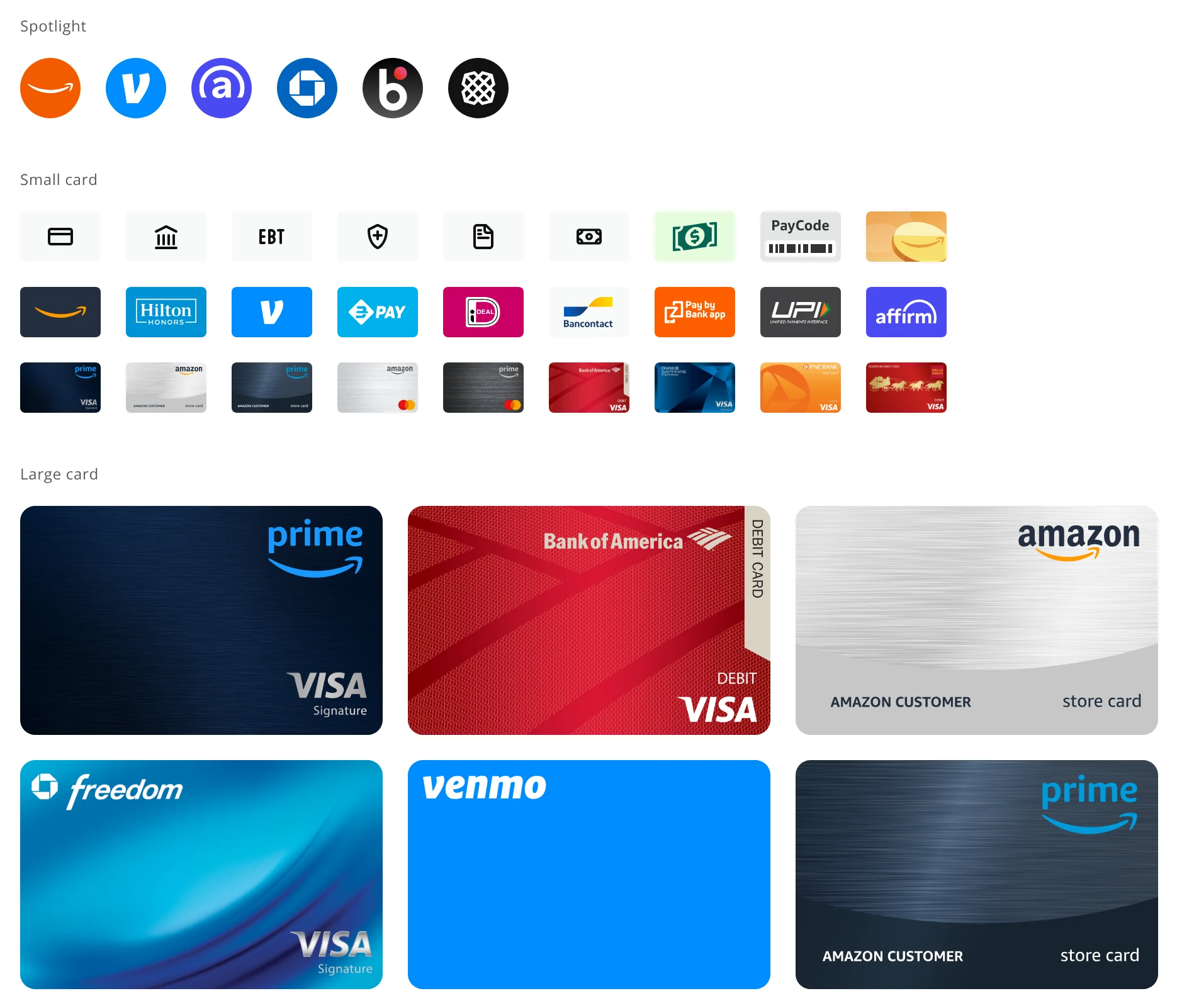
Asset slot

Art

Spotlight marks and card art at fixed sizes, so any method fills the asset slot the same way.

The Art component as specified in the Pay Studio library
Messaging

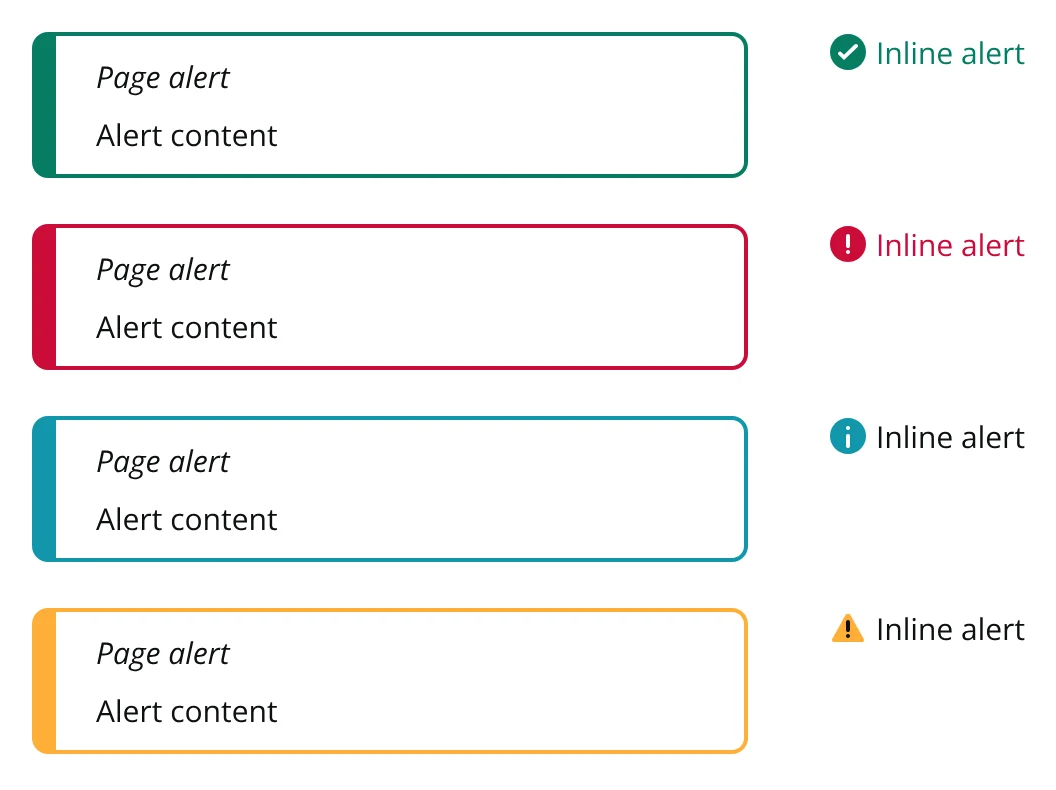
Alert

Page and inline alerts in four severities.

The Alert component as specified in the Pay Studio library
Wallet

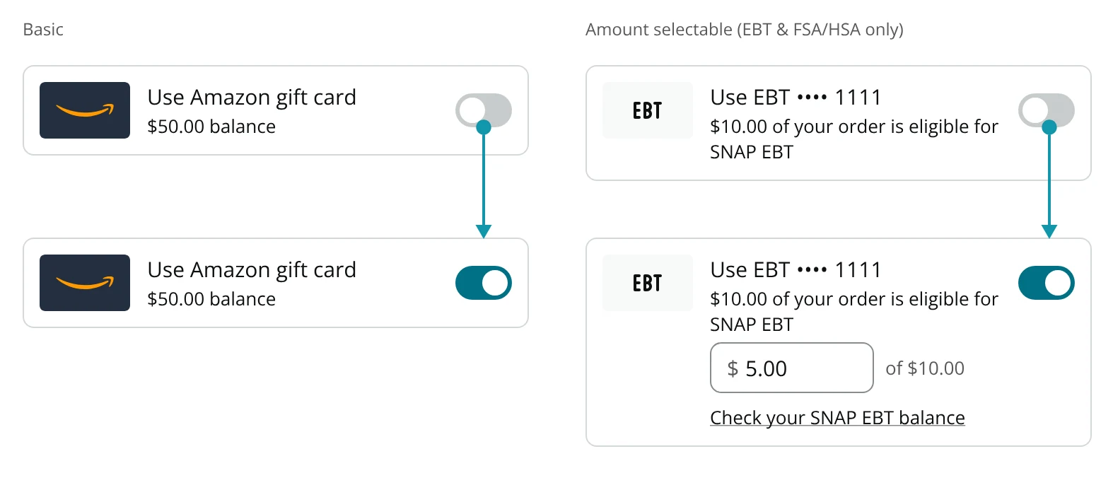
Balance payment method

Gift card, EBT and FSA/HSA balances. Partial-order methods like EBT open an amount field.

The Balance payment method component as specified in the Pay Studio library
Wallet

Claim code

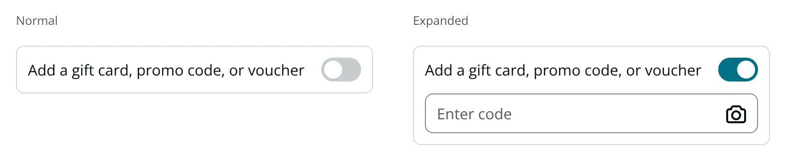
The gift card and promo toggle, with scan-to-add built into the field.

The Claim code component as specified in the Pay Studio library
Inputs

Input code

The six-digit verification field, empty and filled.

The Input code component as specified in the Pay Studio library
Navigation

Navigation link

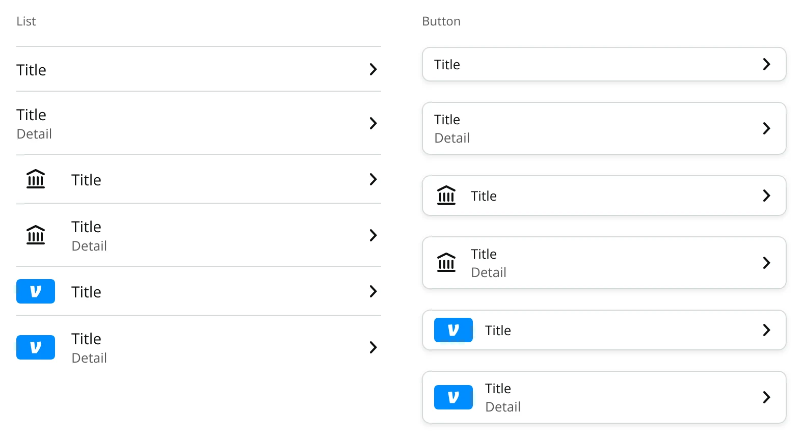
List and button variants. The add-a-method list is built from these.

The Navigation link component as specified in the Pay Studio library
Scan to pay

QR code

Branded codes for scan-to-pay methods.

The QR code component as specified in the Pay Studio library
Feedback

Toast

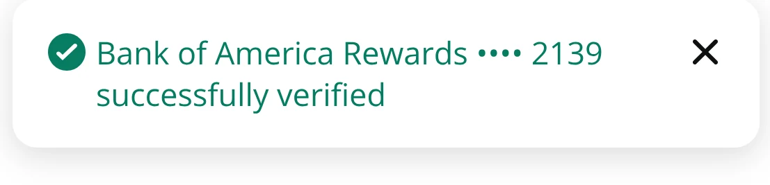
Confirms a verified method by name.

The Toast component as specified in the Pay Studio library

Browse the components in the Figma file →


Builder

Pick it, tweak it, drop it in

Pay Studio came with a builder. Designers could browse every component, set its props, preview its states and copy the code, instead of hunting through a Figma file. Here's a small version: drag components into the sheet, then tap one to customize it.

Components
Properties


Layer two

One base sheet, every task

Templates are complete screens for one task. Instead of designing each one separately, every template starts from one base sheet with a fixed skeleton, and only its body slot changes. Consistency becomes something the file can't break.

Anatomy of the base template: chrome, title block, body slot, primary action, security note 1 2 3 4 5
  1. 1Sheet chrome. Back, brand mark, dismiss. Never changes.
  2. 2Title block. Heading and optional subcopy.
  3. 3Body slot. The only part a template changes.
  4. 4Primary action. One per sheet, always in the same spot.
  5. 5Security note. Wherever credentials are entered.
The base every template inherits from.
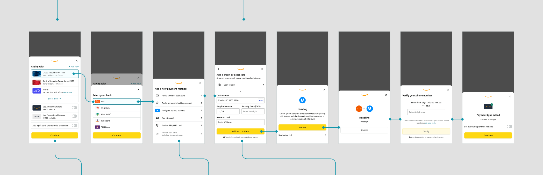
Pay Studio template library: wallet, bank picker, add-method list, card form, base modal, third-party handoff, verification and success
The template library, grouped by task. The plain Heading, Message and Button sheet is the base.

See the templates grouped by task in Figma →


Layer three

A payment method, end to end

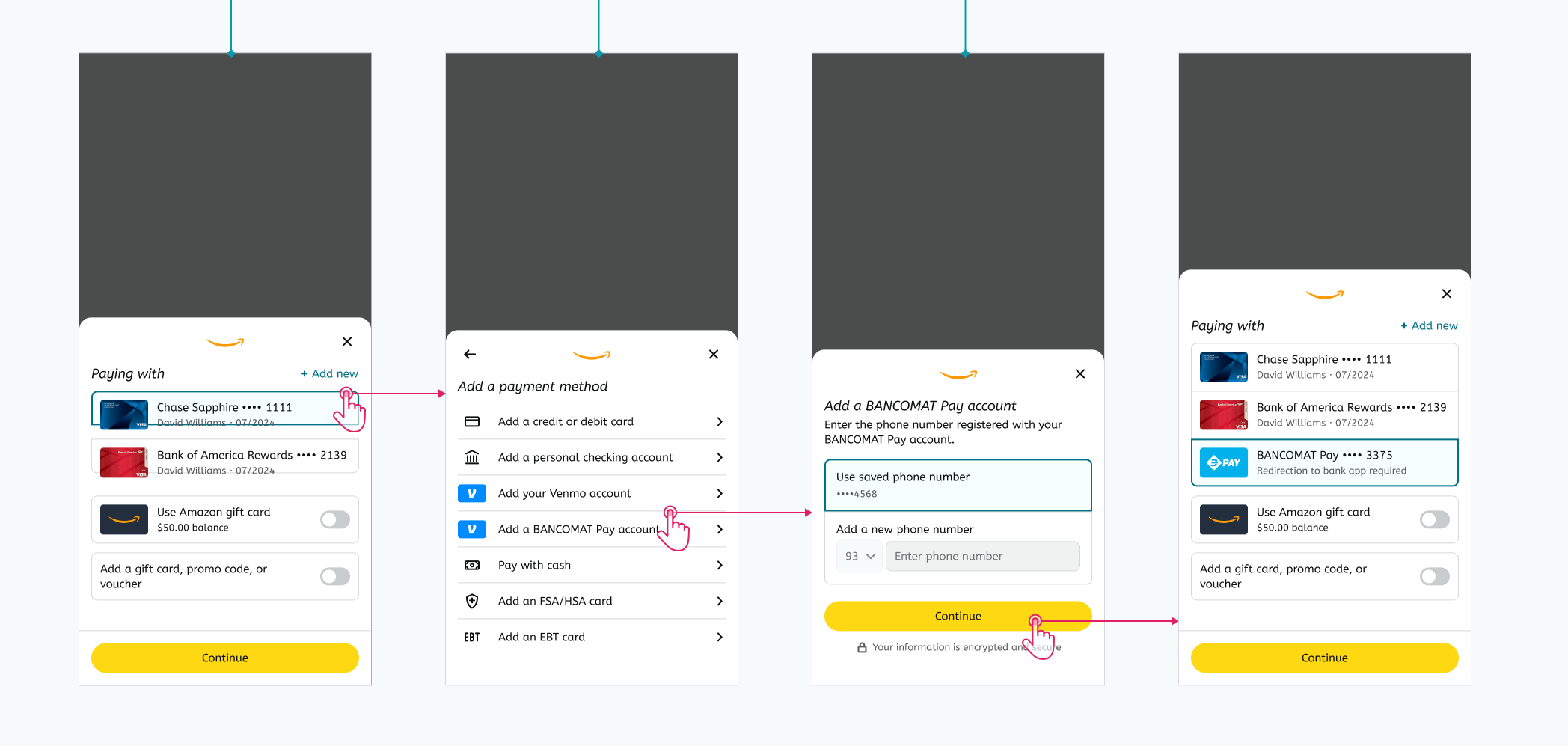
A use case wires templates into a journey. The real test is an awkward method, so here's BANCOMAT Pay, which registers with a phone number and hands off to the customer's bank app. It used to justify a custom flow. Here it's four existing templates.
01
Wallet
Saved methods, plus Add new
02
Add a method
One list row per method type
03
Register
Phone number, not a card number
04
Back to the wallet
New method saved and selected
The BANCOMAT Pay use case: wallet, add a payment method, register a phone number, and return to the wallet with the method selected
The BANCOMAT Pay pathway, built entirely from existing templates.

What it didn't need: a new sheet, a new selection state or a new success screen. Just one list row, one body slot and one line of copy.

See more use case pathways in Figma →


Prototype

Adding a new payment method

Click through the flow, or step it with your arrow keys.

Explore full system in Figma →
After

What it changed

Pay Studio moved payment design from drawing to assembly. Designers across Amazon Business built from the same parts, which sped up production, cut errors and reached 80% adoption in eight months.

The same structure carried into the Amazon Business Credit Card experience the next year, and it's still how I work on Windows Design Systems.

Next project
Amazon Business Credit Card
View project →